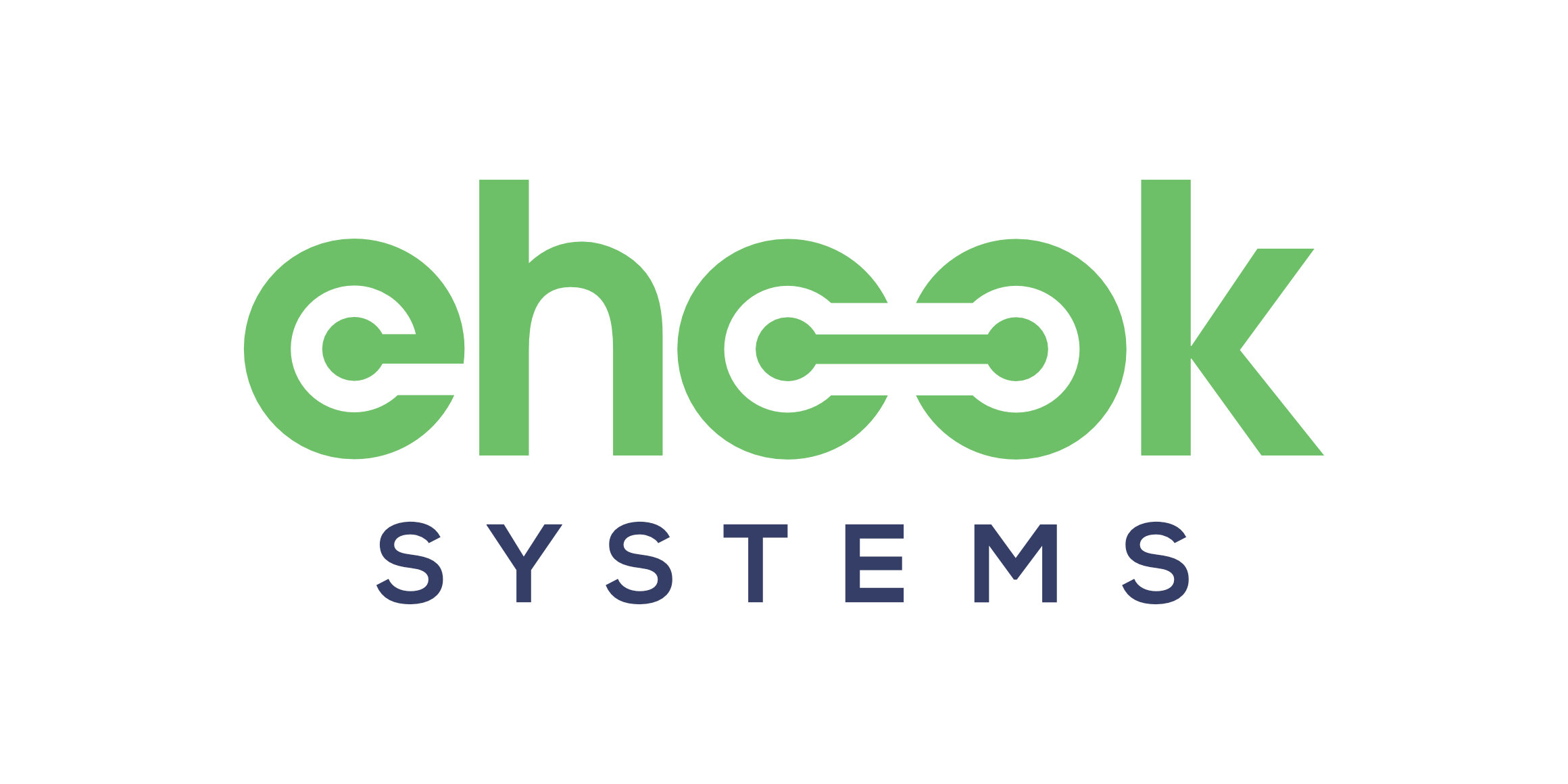
eHook Systems
Occasionally, I come across logos and designs, which I feel could have been taken in a different direction. I take that as a self-development opportunity to explore alternative possibilities. According to their website, eHook Solutions is a leading global technology services company, headquartered in Houston, Texas, providing amongst other things, end-to-end business solutions in web, mobile, e-commerce, cloud computing and payments technology services.
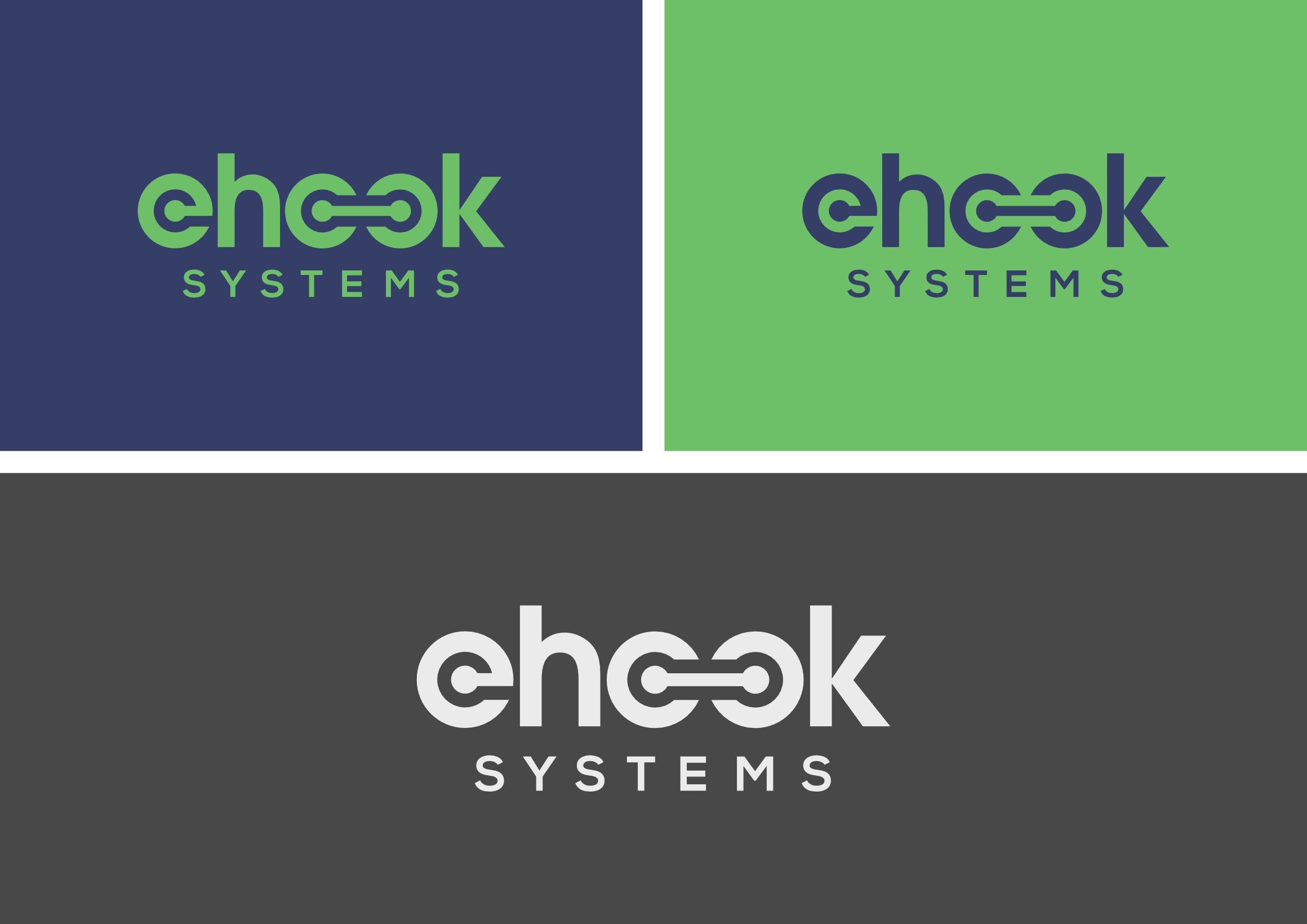
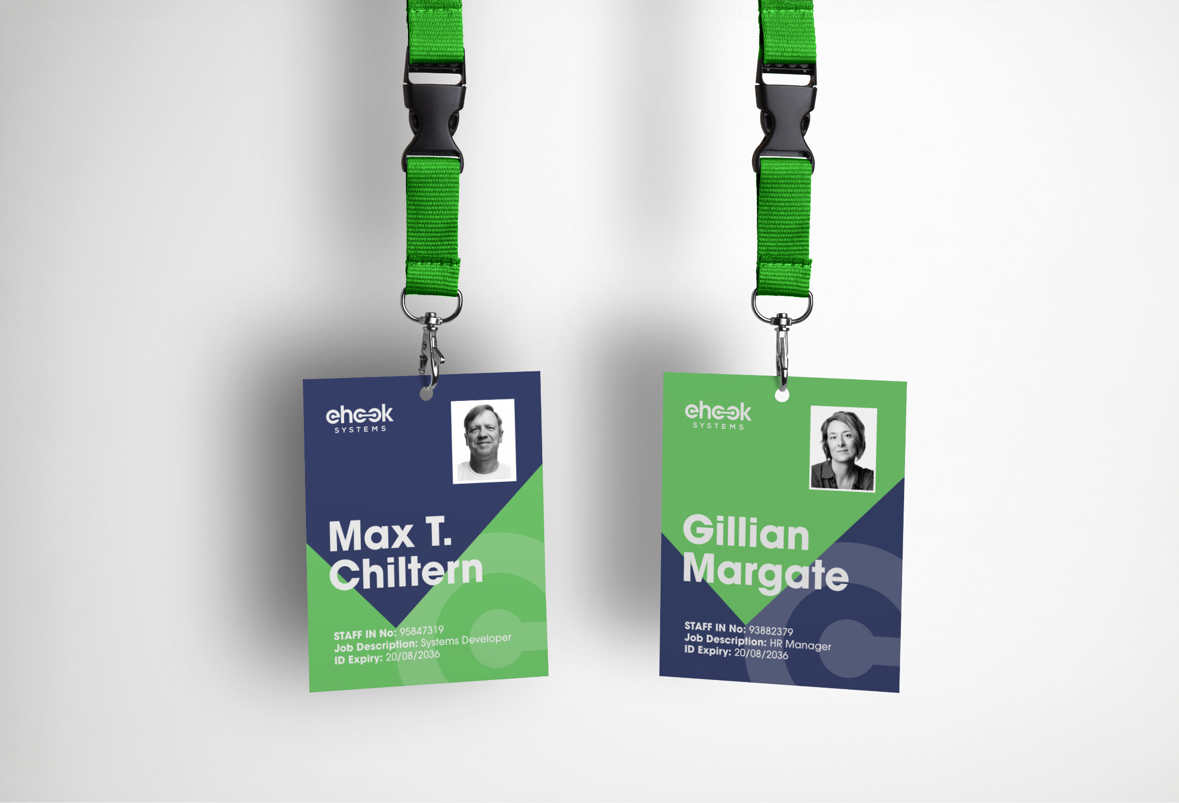
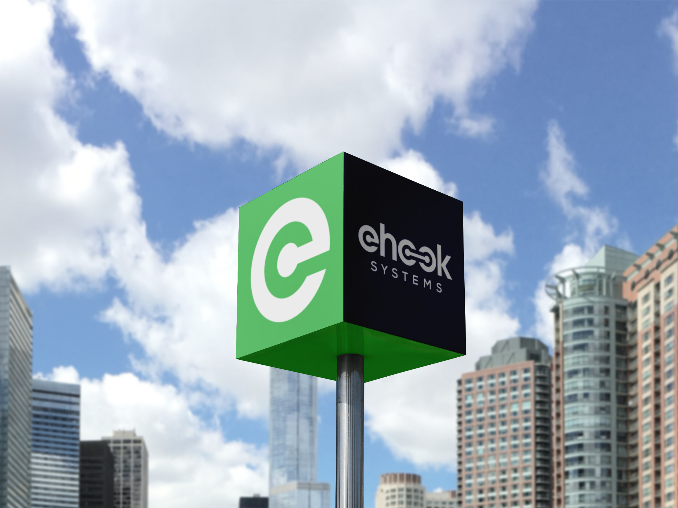
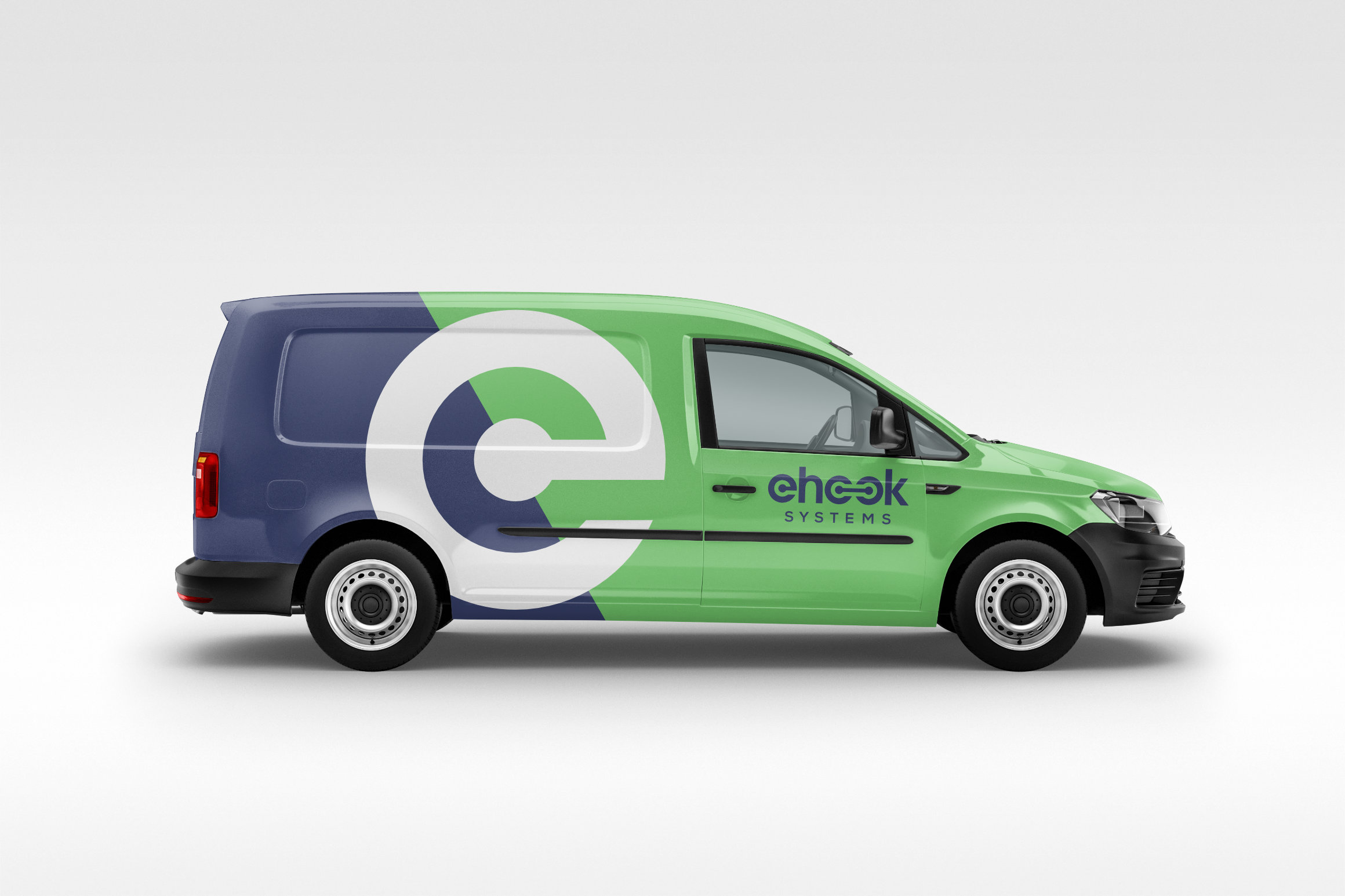
Central to a company like eHook Systems is the promise to support enterprises with ‘connectivity’ solutions through technology, whether it be B2B interfacing, or vendors connecting with their customers. The ‘E’ became a principal focus for developing a standalone icon. The theme of connectivity was then enhanced with visual reference to a PCB connecting track with vias at either end, to form the double-O in the word ‘hook’. The existing corporate colours were maintained to capitalise on any brand equity the company may already have, proposing an evolution rather than a complete departure from the present.