Lauren Housley
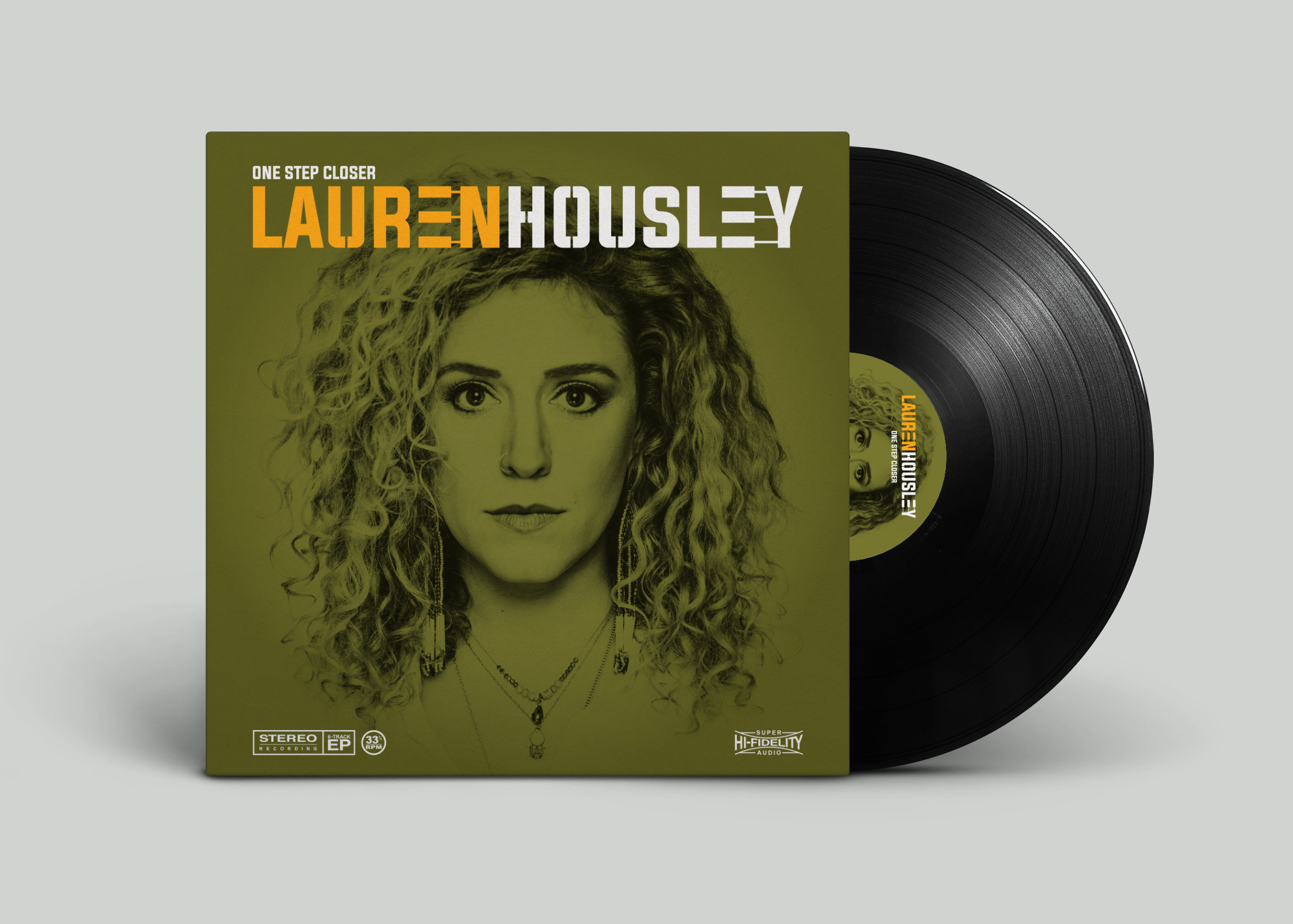
Many moons ago I met and worked with an individual, who in hindsight, may have been nothing more than a 'blagger' (names withheld to protect the innocent). They claimed to be in contact with an up-and-coming singer/songwriter named Lauren Housley. They were pitching for the privilege of managing and marketing her media presence on her journey to stardom. I was tasked with designing Ms Housley’s visual identity, and central to that identity, would be a typographical logo, around which everything revolved. The solution presented was well received by my associate, but to this day, I have no idea if the person that mattered the most, ever laid eyes on it.
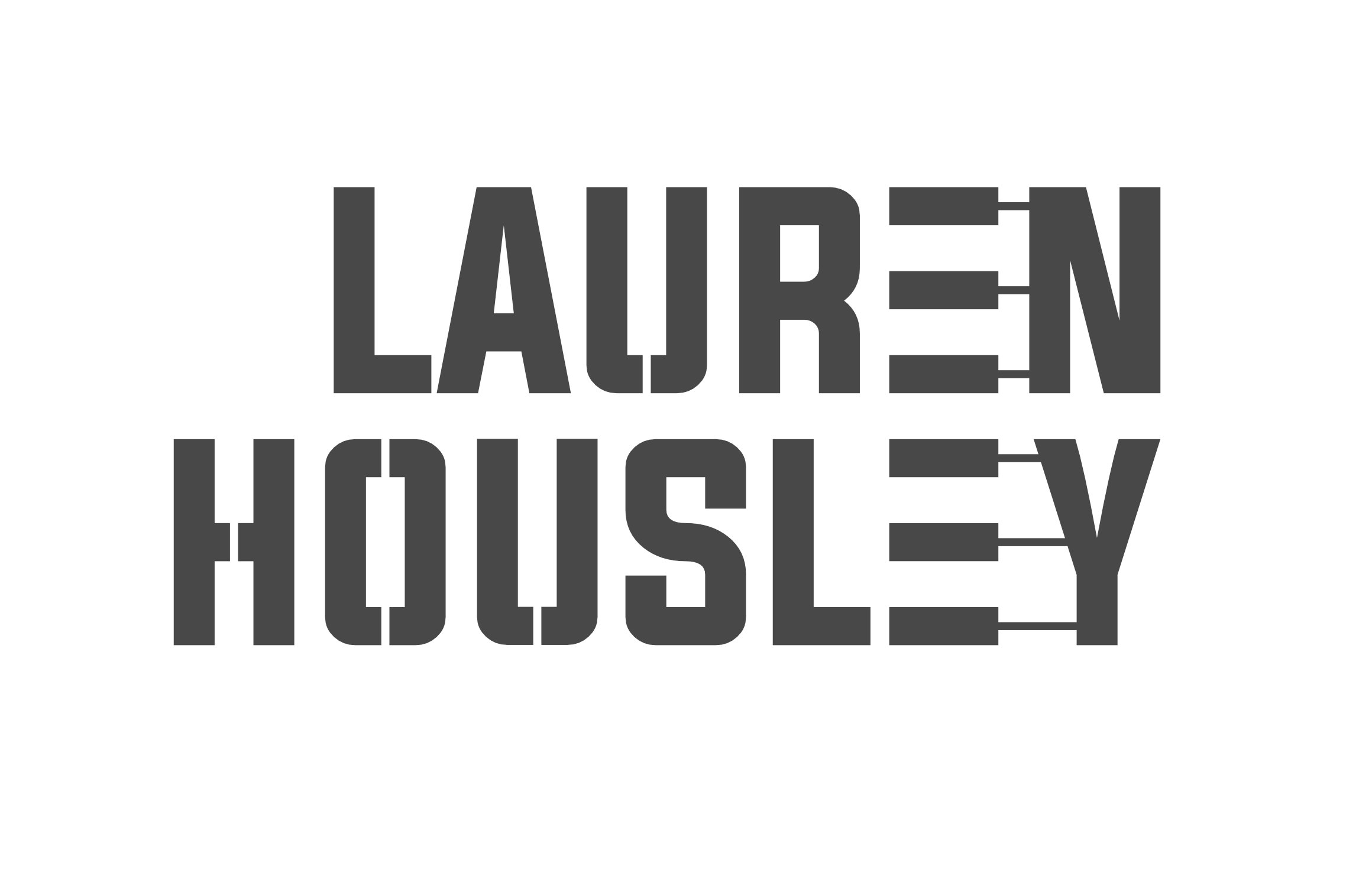
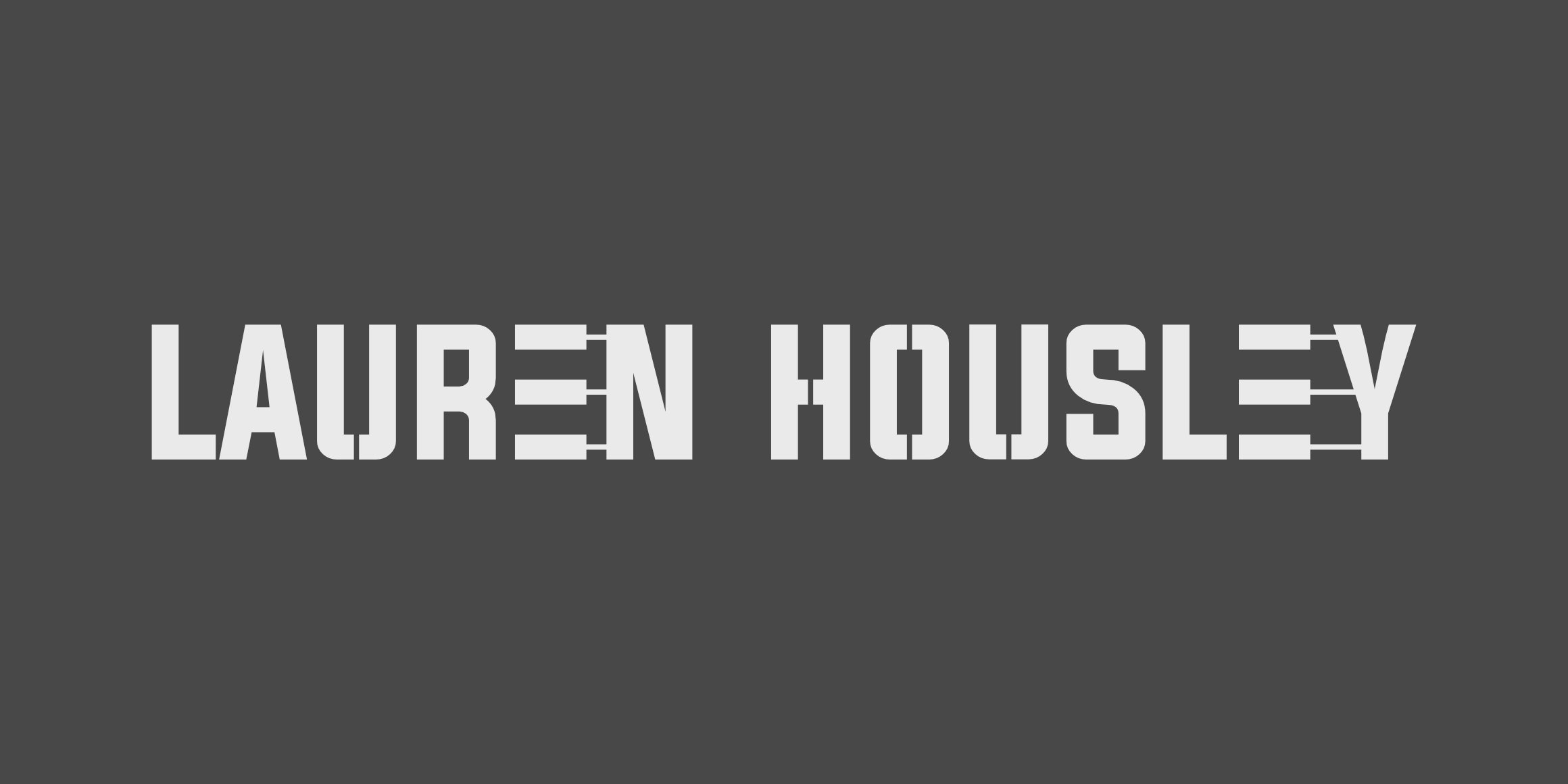
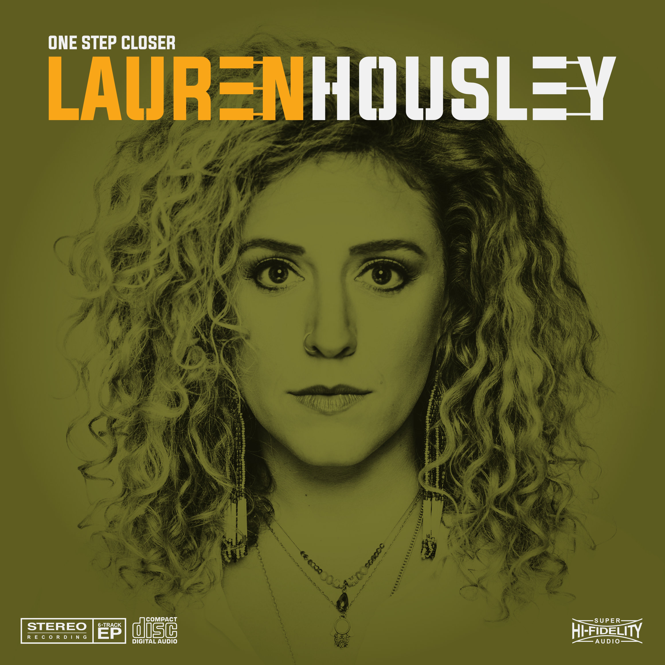
Historically, back in the analogue past of long-playing vinyl records, it was far more common for bands to have a logo, more so than individual artists. Owning and playing vinyl was a ritual in itself, so I set to capture the essence of that experience. Listening to her music, it was evident that Lauren Housley was an old soul in a digital age. Drawing inspiration from the jazz album cover designs of the 50s and 60s, especially those of American graphic designer Reid Miles, I designed an identity that places Ms Housley’s musicianship centre stage. The genesis of most songs can be found in the strings of a guitar or the keys of a piano, so I designed a logo that incorporated piano keys in the typography, with tight kerning and appropriate use of negative space. A bold condensed typeface paid homage to the project’s Blue Note design inspiration.